Verge Labs
- $98MSeries B funding
- $694MEli Lilly partnership
- ForbesPress feature
The challenge
Verge spent close to a decade as a clinical-stage biotech, pairing human genomics with machine learning to find drug targets for diseases like ALS and Parkinson's. Then its lead candidate missed in the clinic, and the company made a hard call: stop developing one drug at a time and become a frontier AI lab, turning ten years of proprietary brain data into models the rest of the industry could build on. The name it had, Verge Genomics, still belonged to the old company. The job was to make the brand read like an AI lab for human biology, precise and a little clinical, without losing the human reason the work exists.
My approach
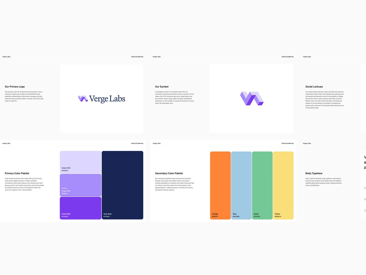
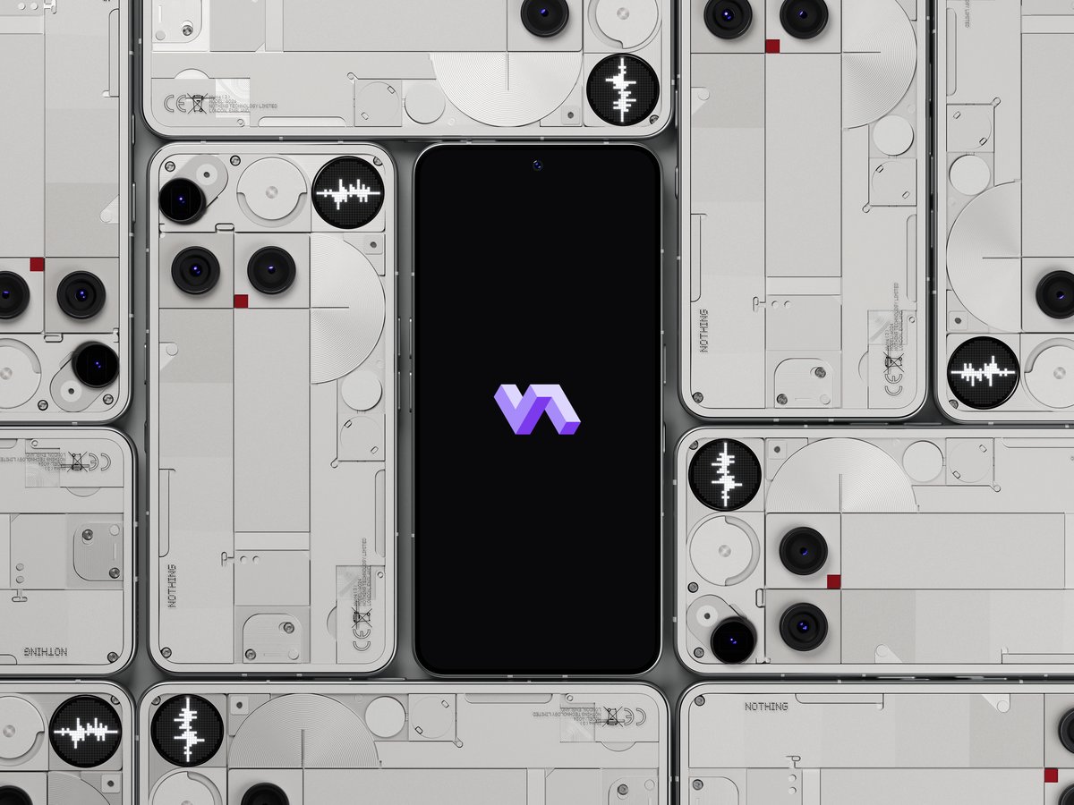
I led the visual rebrand from Verge Genomics to Verge Labs: the symbol, the wordmark and the identity system around them. The symbol is an isometric mark built from interlocking forms, structured and precise, closer to the geometry you associate with a serious AI lab than a pharma logo. I set it against a serif wordmark so the brand reads considered and editorial rather than generic tech. The palette leads with violet, confident and clinical without ever feeling cold, grounded by a deep dark blue for weight, then opens into a warmer set of orange, blue, green and yellow for the human, patient-facing side of the science. Geist carries the body copy so the headline voice can lead. All of it shipped as a brand guidelines system the team can run with across every surface.
The result
Verge Labs launched in May 2026 with the new name and a complete identity: primary logo, standalone symbol, social lockups, a two-tier colour system and type. The brand now matches what the company actually is, not a drug maker but a frontier AI lab, and gives a small team a consistent way to show up as they take that story to the industry.